Looking back at MacOS wallpapers is like going through a scrapbook of Apple’s past. Starting with Mac OS X 10.0 Cheetah in 2001 and going all the way to macOS Sonoma in 2023, each wallpaper has its own story and shows a bit of what Apple was all about at that time. These aren’t just cool backgrounds; they’re like markers of how Apple has grown and changed. As we go through them, I’ll share some of my own thoughts on these wallpapers – the good, the not-so-good, and how they made me feel.
Mac OS X 10.0 Cheetah and 10.1 Puma (2001)
In 2001, the arrival of Mac OS X 10.0 Cheetah and 10.1 Puma brought a fresh breeze to the world of desktop wallpapers. The new default wallpaper was a splash of blue arcs and curves, signaling the start of the Aqua interface era. This design was a clear break from the past, signaling a new direction for Mac. It was simple yet captivating, setting a new standard for what Mac users could expect from their desktop experience.

Mac OS X 10.2 Jaguar (2002)
Come 2002, with Mac OS X 10.2 Jaguar, the Aqua theme got an exciting twist. The wallpaper evolved from its initial simplicity to a more dynamic scene, resembling comets zooming across a night sky. This wasn’t just a picture; it felt alive, adding a sense of speed and vitality to the Mac desktop. The Aqua theme was still there, but it was like it had been given a shot of adrenaline, making the user’s screen feel more energetic and active.

Mac OS X 10.3 Panther (2003)
In 2003, Mac OS X 10.3 Panther stirred the pot with its Brushed Metal interface, but the wallpaper kept its loyalty to the Aqua theme. It was like Apple was trying to balance the old with the new. The wallpaper still had that Aqua vibe – cool, calm, and collected – but with a bit more maturity. It was as if the Aqua had grown up, getting a bit more sophisticated while keeping its essence.

Mac OS X 10.4 Tiger (2005)
By 2005, Mac OS X 10.4 Tiger refined what was already great. The Aqua-inspired wallpaper was at its best – clean and sharp. Tiger just improved on what worked, without big changes. These were the last wallpapers in the Aqua theme, showing off a simple, yet cool and sleek look that really summed up the Mac vibe at the time.

Mac OS X 10.5 Leopard (2007)
In 2007, Mac OS X 10.5 Leopard brought a significant change with its space-themed wallpaper. This new look was a departure from the Aqua style, featuring a galaxy filled with stars, giving a feel of looking out into the cosmos.
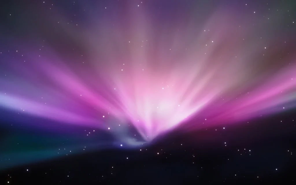
Additionally, Leopard Server had its own distinct wallpaper, offering a variation for server macOS users.

Mac OS X 10.6 Snow Leopard (2009)
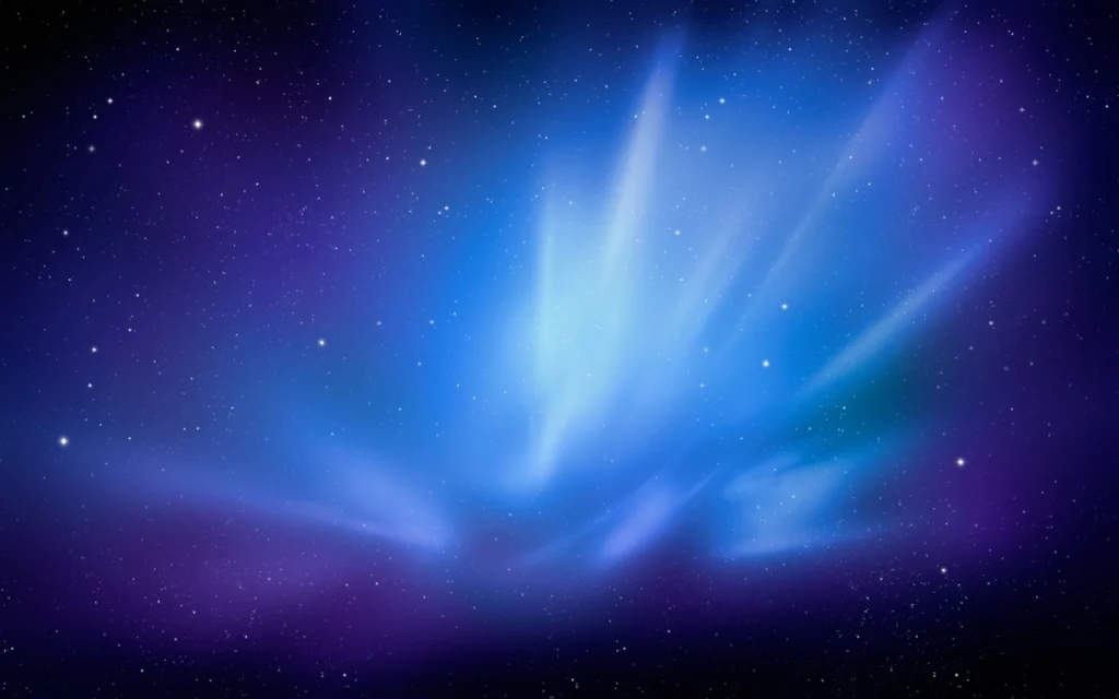
With the arrival of Mac OS X 10.6 Snow Leopard in 2009, Apple continued the space theme but in a more subdued manner. The wallpaper depicted a tranquil night sky, dotted with stars, creating a calm and peaceful backdrop.

Snow Leopard also had a server version, which came with a different wallpaper.
Mac OS X 10.7 Lion (2011)
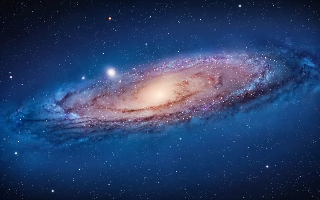
2011’s Mac OS X 10.7 Lion took a bold step with its wallpaper, featuring the Andromeda galaxy. It was a bit of a change-up from the previous wallpapers. Some people really liked this bold, galactic view, while others thought it was a bit too much. Either way, it showed that Apple wasn’t afraid to try something different.
Mac OS X 10.8 Mountain Lion (2012)
With Mac OS X 10.8 Mountain Lion in 2012, Apple went for a more subtle and elegant wallpaper. It wasn’t as showy as Lion’s galaxy view. Instead, it had a more understated style, fitting well with the operating system’s overall sleek and smooth feel.

Mac OS X 10.9 Mavericks (2013)
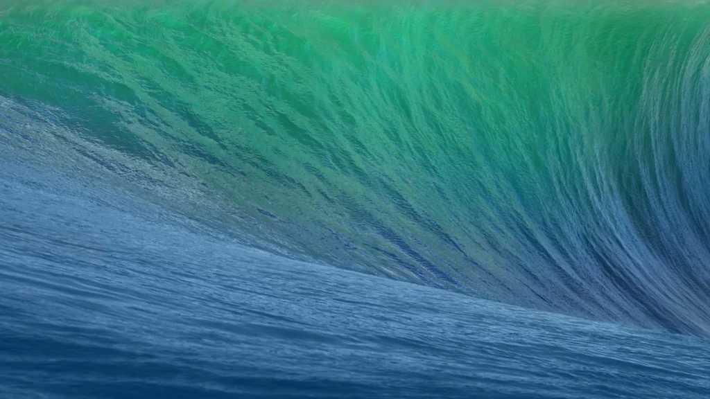
In 2013, Mac OS X 10.9 Mavericks introduced a significant shift with its wallpaper featuring a giant wave. This marked the beginning of a new era for MacOS wallpapers, where Apple started using photographs of nature. Named after the famous surfing location, the Mavericks wallpaper showcased a stunning and realistic image of a massive wave. This change to using real-life nature photography was a departure from previous versions’ more abstract and graphical wallpapers, bringing a touch of the natural world directly to users’ screens.
Mac OS X 10.10 Yosemite (2014)
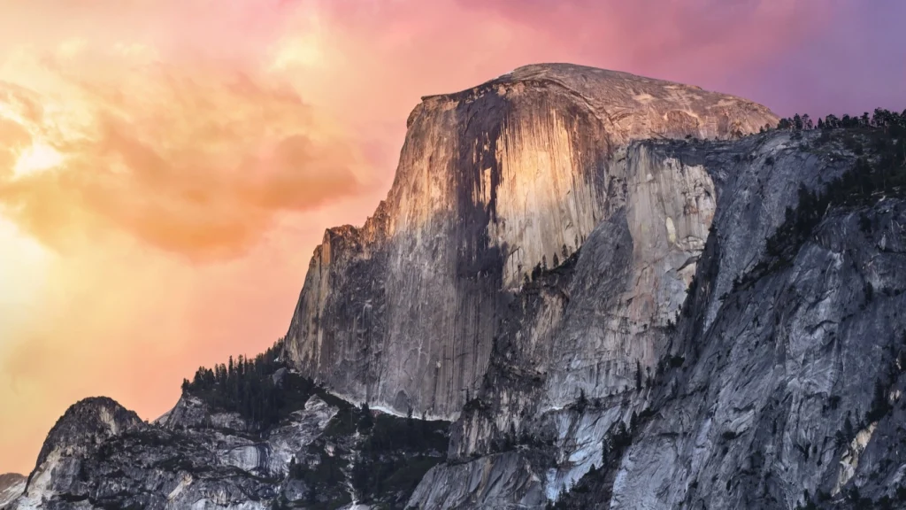
The release of Mac OS X 10.10 Yosemite in 2014 marked a notable shift in Apple’s approach to MacOS wallpapers. It featured a clean, minimalist mountain view, embracing a flatter and more modern aesthetic. This wallpaper was not just a visual element but a statement of simplicity and elegance. The minimalist mountain against a serene sky offered a tranquil and uncluttered backdrop, reflecting a sleek and simplified technological design trend.
Mac OS X10.11 El Capitan (2015)
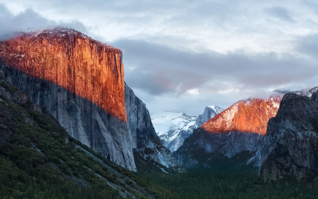
In 2015, Mac OS X10.11 El Capitan continued the trend of showcasing natural beauty with its wallpaper. This time, the focus was on the El Capitan rock formation in Yosemite National Park. The wallpaper brought the majesty and grandeur of this natural wonder to the forefront, offering users a stunning view every time they looked at their screens. The level of detail and the vividness of the image made the El Capitan wallpaper not just a background but a centerpiece of the desktop, inspiring awe and appreciation for nature’s magnificence.
Mac OS X 10.12 Sierra (2016)
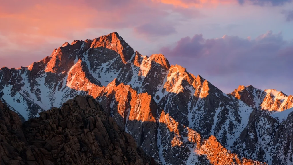
With Mac OS X 10.12 Sierra in 2016, Apple chose to stick with the mountain theme but introduced a new landscape. This wallpaper continued the natural theme but with a fresh perspective. The Sierra wallpaper featured a familiar yet distinct mountain scene, capturing the essence of tranquility and the enduring beauty of the natural world. It blended familiarity and novelty, offering a comforting yet refreshing backdrop for the MacOS experience.
Mac OS X 10.13 High Sierra (2017)
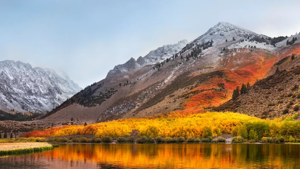
In 2017, Mac OS X 10.13 High Sierra introduced a new wallpaper that featured even higher mountain peaks. This wallpaper was dominated by an orange hue, which personally, I wasn’t very fond of. The choice of color gave it a distinct look compared to previous wallpapers, but it might not have been to everyone’s taste.
Mac OS X 10.14 Mojave (2018)
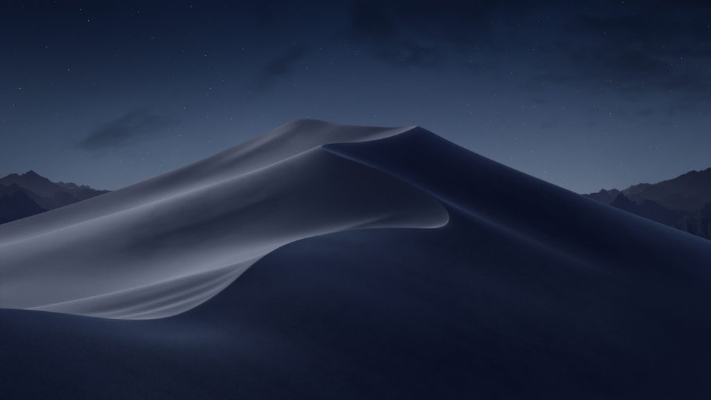
The launch of Mac OS X 10.14 Mojave in 2018 brought a big change to its wallpaper. For the first time, a wallpaper changed between light and dark modes, showing a desert landscape.
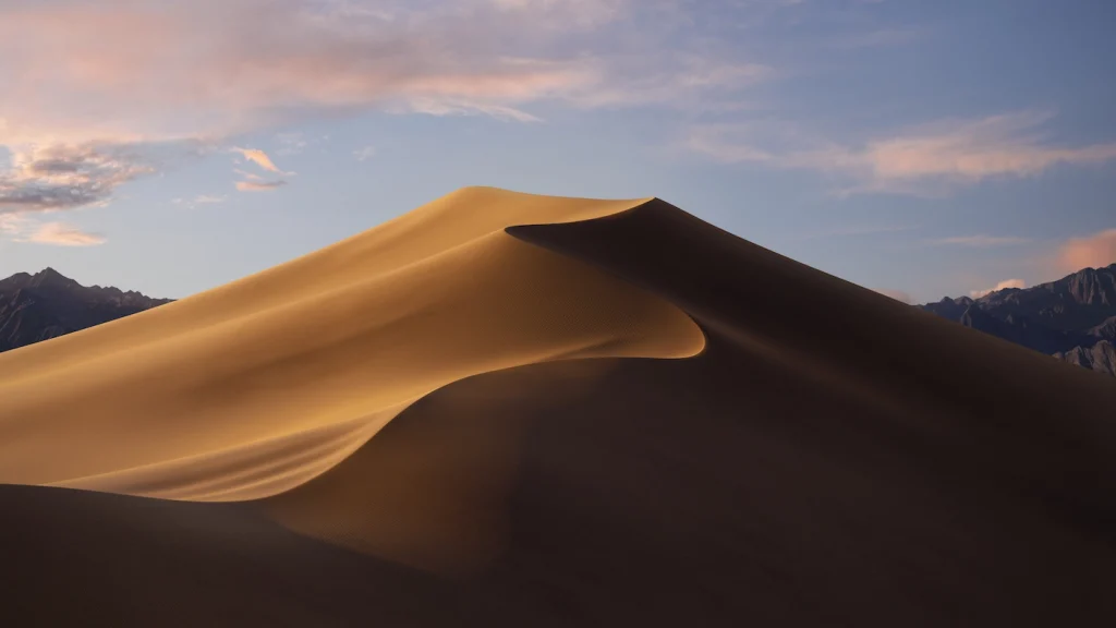
The wallpaper changed from a bright desert day to a dark, starry night, showing the new OS’s flexibility and adaptability.
Mac OS X 10.15 Catalina (2019)
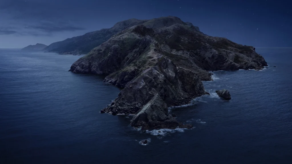
The wallpaper featured a peaceful coastal scene with Mac OS X 10.15 Catalina in 2019. It was like a bit of escape to the beach every time you looked at your screen.
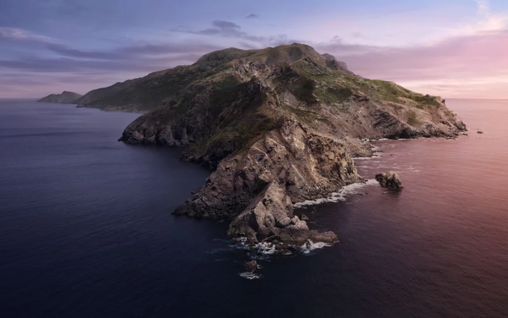
This wallpaper also changed day to night, adding a nice touch that made your computer feel more connected to the outside world.
MacOS 11.0 Big Sur’s (2020)
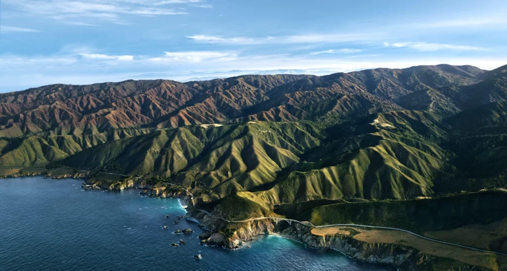
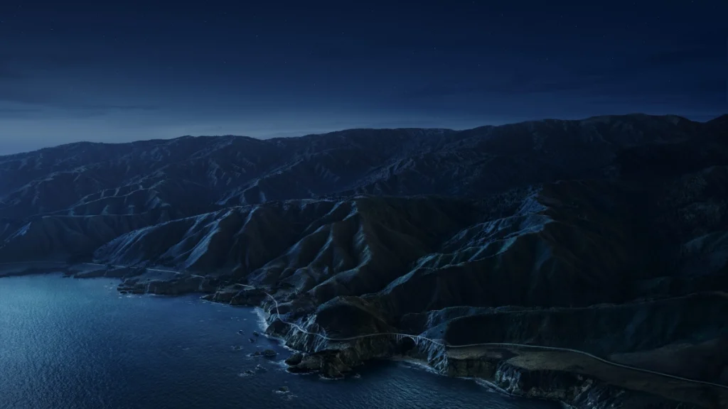
In 2020, macOS made a significant leap with the release of Big Sur, so much so that Apple bumped the version number to 11.0. A standout feature in this version was the two variations of the standard wallpaper, both depicting Big Sur. One version was a graphic interpretation of this stunning location, offering a stylized and artistic view.

Night version.
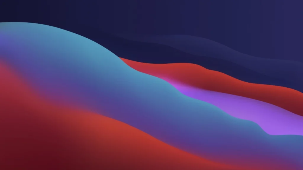
The other was an actual photograph, capturing the natural beauty of Big Sur in vivid detail. Both versions came with their own night versions, continuing the trend of dynamic wallpapers that change from day to night.
Night version.
MacOS 12.0 Monterey (2021)
In 2021, macOS 12.0 Monterey took a turn away from the real-life nature photos that I really liked. Instead, it went for an abstract, fluid design. This was a big change from the previous wallpapers; honestly, I missed those beautiful real-world images. The new design was more about looking sleek and fitting in with the overall system, but it didn’t have the same appeal as those stunning landscapes and natural scenes from before.

Night version.

MacOS 13.0 Ventura (2022)
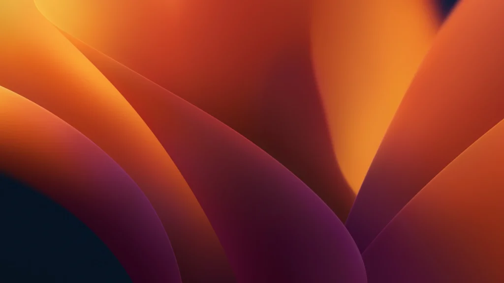
In 2022, macOS Ventura introduced a wallpaper that, frankly, wasn’t particularly remarkable. It had a modern look but didn’t stand out much compared to previous years.

However, what I did appreciate was its night theme. The night version of the wallpaper was quite impressive, adding a nice touch to the overall aesthetic and giving the desktop a pleasant look in low-light conditions.
MacOS 14.0 Sonoma (2023)
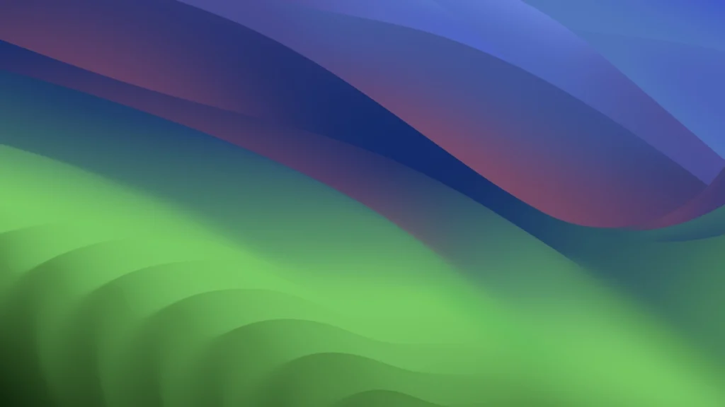
The 2023 release of macOS Sonoma brought with it a new wallpaper, aligning with the theme of interactive widgets. This wallpaper, available in light and dark themes, had a distinct style. Personally, I found the daytime version a bit too bright, mainly due to its intense shade of green. It seemed quite bold and potentially not to everyone’s taste.
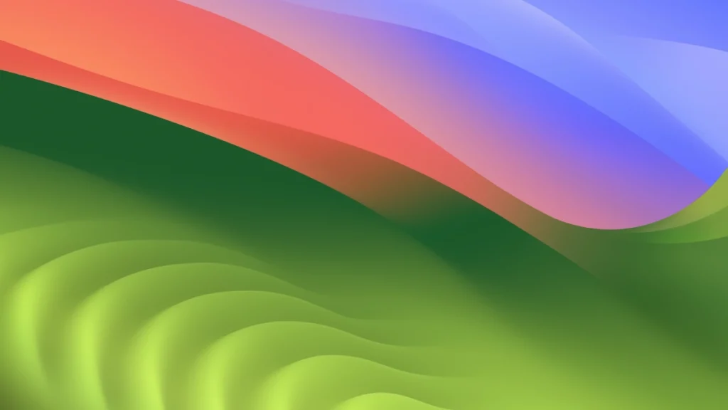
On the other hand, the nighttime theme was more subdued and didn’t feature the same brightness level, making it a more comfortable choice for daily use.
